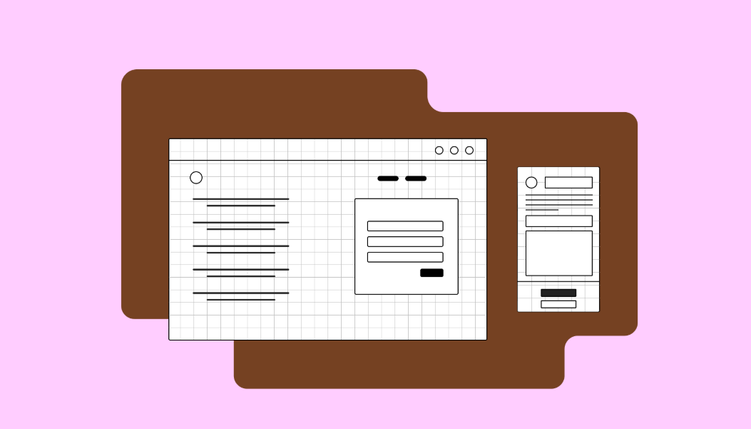
Best Practices for Form Design to Maximize Submissions

Forms are one of the most important conversion tools on a website. Whether it’s a contact form, newsletter signup, lead capture, or checkout form, poorly designed forms can frustrate users and drastically reduce submission rates. In 2026, with user attention spans shorter than ever, effective form design is critical for maximizing conversions.
A well-optimized form not only collects essential information but also provides a smooth, intuitive experience that encourages users to complete it. Here’s a comprehensive guide to best practices for form design that drive more submissions.
1. Keep Forms Short and Simple
Lengthy forms overwhelm users and lead to abandonment. Every extra field increases friction and reduces the likelihood of submission.
Best practices:
-
Only ask for essential information (e.g., name, email, and relevant details)
-
Use multi-step forms for longer processes, showing progress
-
Group related fields logically for easier scanning
Example: Instead of asking for full address and phone number upfront for a newsletter signup, start with just the email.
2. Use Clear Labels and Instructions
Ambiguous fields confuse users and increase errors. Each form field should have a clear, descriptive label.
Tips:
-
Use simple language
-
Place labels above the field for mobile-friendliness
-
Provide inline instructions or placeholders if needed (but not as a replacement for labels)
For instance, instead of “Enter info,” use “Enter your email address.”
3. Highlight the Call-to-Action (CTA)
Your submission button is the most critical element of a form. If it’s unclear or buried, users may not complete the form.
Best practices:
-
Use contrasting colors to make the button stand out
-
Use action-oriented text like “Get My Free Quote” or “Sign Up Now”
-
Make the button large enough for mobile users to tap easily
4. Optimize for Mobile
With more than half of web traffic coming from mobile devices, forms must be mobile-friendly.
Key points:
-
Use single-column layouts for easier scrolling
-
Ensure fields and buttons are touch-friendly
-
Avoid pop-ups that are difficult to close on mobile
Responsive forms reduce friction and increase mobile submissions.
5. Implement Real-Time Validation
Users hate submitting forms only to encounter errors after the fact. Real-time validation immediately informs them of mistakes, improving the submission experience.
Tips:
-
Highlight errors clearly in red with helpful instructions
-
Validate inputs as users type (e.g., email format, required fields)
-
Confirm successful submissions with a thank-you message
6. Use Progress Indicators for Multi-Step Forms
For long forms, breaking them into smaller steps reduces user fatigue. Progress indicators show users how much is left, increasing motivation to complete the form.
Example:
-
Step 1: Personal Information
-
Step 2: Service Details
-
Step 3: Review & Submit
This approach makes long forms feel manageable.
7. Leverage Auto-Fill and Smart Defaults
Auto-fill speeds up the process and reduces errors. Whenever possible, pre-populate fields with known user data or provide smart defaults.
Benefits:
-
Saves time for users
-
Reduces friction
-
Improves completion rates
For example, automatically detecting the user’s country or using previous entries can increase submissions.
8. Minimize Distractions
Forms should have a focused layout that draws attention to completing the submission. Avoid unnecessary elements around the form that may distract users.
Tips:
-
Remove unrelated navigation links near forms
-
Limit pop-ups or promotional banners
-
Keep the surrounding area clean and visually appealing
9. Build Trust with Security and Privacy
Users hesitate to share personal information if they don’t trust your site. Demonstrating security and transparency encourages form submissions.
Best practices:
-
Use HTTPS to secure your website
-
Include privacy statements near sensitive fields
-
Avoid asking for unnecessary sensitive information
Trust signals reduce anxiety and boost form completion rates.
10. Test and Optimize Continuously
Even small changes can have a significant impact on form performance. Regularly A/B test elements such as:
-
Field order and length
-
CTA text and color
-
Single-step vs multi-step layouts
-
Error messages and validation methods
Tip: Use analytics to track form submissions and identify drop-off points for continuous improvement.
Conclusion
Forms are a key conversion tool, and poor design can cost you leads, subscribers, and sales. By following these best practices for form design, you can create forms that are simple, intuitive, and optimized for maximum submissions.
Focus on:
-
Short, clear forms
-
Mobile-friendly layouts
-
Actionable CTAs
-
Real-time validation
-
Trust-building elements
A well-designed form reduces friction, increases user confidence, and ultimately boosts your conversion rates.
Your website is more than just a digital presence — it’s a powerful tool for attracting customers, building trust, and driving conversions. As a top Website Design Agency Toronto, Edkent Media specializes in creating custom websites that are visually stunning, user-friendly, and optimized for results.
- Art
- Causes
- Crafts
- Dance
- Drinks
- Film
- Fitness
- Food
- Oyunlar
- Gardening
- Health
- Home
- Literature
- Music
- Networking
- Other
- Party
- Religion
- Shopping
- Sports
- Theater
- Wellness

