
Food Truck Menu Boards & Cafe Menu Boards: Design, Strategy, and Setup
Introduction: Small Spaces, Big Impact
The similarity between food trucks and cafes is that physical space is limited, and menus must be understood quickly and clearly. These mobile and small-scale businesses do not have long to capture attention and guide an order. The menu board—whether chalkboard, printed, or digital—is the key sales tool.
Food truck menu boards must handle vibration, weather, and daily setup/tear-down. Cafe menu boards, on the other hand, should feel warm, crafted, and easy to update for seasonal drinks and daily pastries. This article covers best practices for both settings.
Food truck menu boards Mobility first
Food truck boards have special physical demands. The board is in motion, takes road vibration, and often operates in sun, wind, or light rain. Durability is non-negotiable.
Successful food trucks commonly use three formats:
-
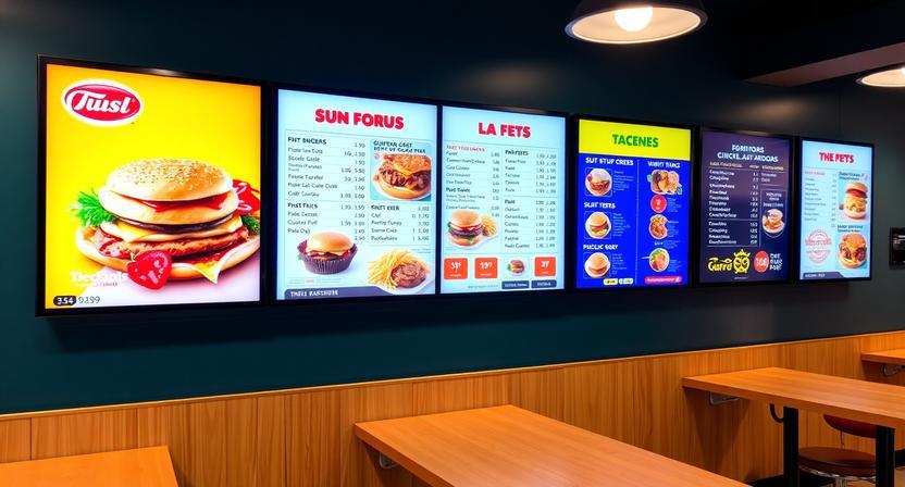
A backlit LED/LCD screen mounted inside the service window. Digital food truck menu boards allow real-time price updates and daypart switching (breakfast vs. lunch). They need stable power and anti-vibration mounting.
-
A weatherproof acrylic or aluminum panel with removable vinyl lettering. It is cheaper and long-lasting, but updates require new vinyl and tools.
-
A chalkboard or chalk-marker board. It looks attractive and is flexible, but needs frequent rewrites and can wash out in rain.
No matter what material is used, food truck menu boards should follow the three-second rule: customers should understand the cuisine, top items, and pricing in about three seconds. Keep it short, clear, and easy to scan.
Key items to display
-
Business name or logo (small, at the top)
-
3–5 signature items (largest text)
-
Prices aligned consistently
-
One special or meal of the day
-
Simple dietary markers (GF, V, N) if needed
Categorizing items (Tacos, Bowls, Sides) helps customers decide faster than an alphabetical list.
Cafe menu boards Functionality meets ambiance
Cafe menu boards serve a different purpose. Cafes are places where people linger—work, read, or meet friends. The menu board must stay efficient for morning rush ordering but also match the cafe’s feel.
Many independent cafes use chalkboards or magnetic letter boards. They look handcrafted and can be updated daily. The downside is readability: if the board is small or messy, customers get annoyed because they cannot scan choices quickly.
Multi-location chains more often use digital cafe boards, which can show latte art images and pastry visuals. But excessive animation feels rushed and can clash with a calm cafe environment.
Best practices for cafe menu boards
-
Place the most profitable items at eye level (often near the center)
-
Group by drink type (Espresso, Brewed Coffee, Tea, Cold Drinks), then by size
-
Show prices clearly for every size
-
Include one or two strong food photos (pastries or sandwiches)
-
Leave whitespace—crowded boards look cheap and overwhelm undecided customers
Typical fallacies to watch out
-
Too many choices: big menus slow lines and create decision paralysis
-
Illegible fonts: script looks nice but is hard to read at distance—use clear fonts for main items
-
Poor price alignment: scattered pricing forces customers to hunt—keep pricing consistent
-
Forgetting viewing distance: festival customers may view from 10–15 feet; cafe boards are usually closer
Conclusion
Food truck and cafe menu board share the same goal—turn hungry visitors into paying customers—but the environments are very different. Food trucks need rugged, weather-ready, high-clarity boards that work instantly. Cafes need boards that feel inviting, readable, and calm.